When designing a website, how do you make sure useful information about your business is reaching your target audience? It goes far beyond designing a visually appealing and functional website. Keep reading to see the best website navigation practices that can benefit your site visitors and improve user experience.
Table of contents
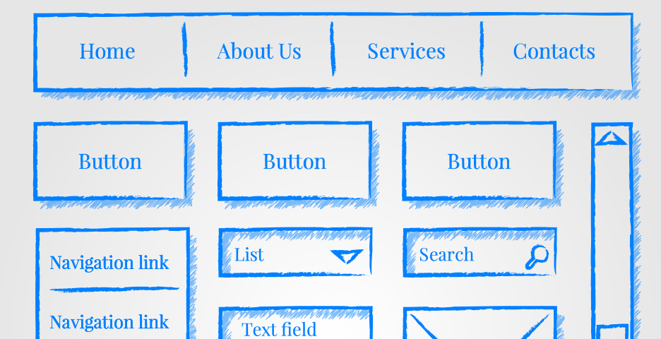
When planning and designing your website, it is necessary to sit down and carefully organize your navigation menu. The navigation menu should clearly display all the levels of information available for website visitors. This begins at the top-level navigation and transitions to mapping out where internal pages fall within those top-level menu items.
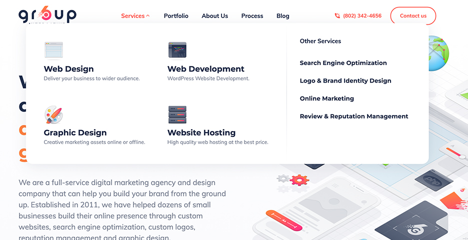
Though dropdown menus can be useful for providing space for additional pages, there are two reasons why you want to avoid them, or at least limit your usage of them. The first reason is that drop down menus can be challenging for search engines to crawl. The second reason is that website visitors may become confused by the options available, increasing the risk of them skipping top-level pages. There is one exception. If your website offers numerous products or services, you may consider a mega dropdown menu to help people find what they need, like ours. This type of menu enables you to list several categories with their own short list of menu items. This helps your users by eliminating the need to click through multiple menus.

Continuing the topic of navigation menus, you should limit the number of items in your menu to seven or fewer. Too many items listed can result in users skipping over important pages or becoming quickly overwhelmed. Shorter lists are easier for visitors to scan and read.
Menu items should be descriptive. Avoid broad, generic descriptions and instead use terminology that is relevant to visitors and search engines. Using descriptive labels for each page improves your SEO and increases the chances of ranking high in relevant search queries.
Consistent website design and layout will provide a more positive user experience and help to keep bounce rates low. This includes your navigation menu and logo being easy to find and in the same position on each page, so users are not spending time searching for these features. Also, make the logo clickable, so it takes the user back to the home page. This eliminates the need for users to click through the navigation menu, further improving user experience.
With 56% of online traffic being on mobile devices, it is crucial that your website be accessible on different types of devices. Responsive navigation may include a hamburger menu (the three horizontal lines seen at the top corner of the screen on mobile-friendly sites) which will improve user experience because it is compact, will not interfere with other buttons, and fits well on both desktop and mobile devices. If your website is not accessible on mobile devices, users may make a mental note to visit later, but they’re more likely to simply move on to one of your competitors instead.
Internal links within your written content are helpful because they allow users to navigate through your website more effortlessly. Internal links also help reduce your website’s bounce rate because they improve the likelihood users will find relevant content which will encourage them to stay on your site longer. Sitewide internal linking will increase opportunities for new users to see topics that may interest them, resulting in more page views and a higher conversion rate.
A search bar makes it easy for users to find the information they need quickly and with minimal clicks. To make searching even easier for website visitors, use a sticky search bar that can clearly be found. Ensuring your internal search engine produces accurate results for website visitors is important because if users cannot find the information they are interested in, they may leave the website and look elsewhere. Other ways to improve the search function is to program it to generate results for misspelled words, include a filter option for users, and to auto-populate results based on most common searches.
If a user scrolls all the way down to your footer, that means they are engaged, and you ought to take advantage of this by using the footer to feature important content. The site footer allocates you a space to include content that doesn’t fit in your header or navigation menu. This is also the best location for a sitemap. Users already have a navigation menu, why do they need a sitemap? The answer is they really don’t, but search engines do. Having a sitemap makes it easier and quicker for search engines to crawl your entire website because all the information they are looking for is in one location.
If you’re ready to design your website or looking for a consultation to optimize your website performance, Group6 Interactive’s creative team of designers and developers have the knowledge to bring your website to the next level. Contact us today by calling (802) 342-4656 or sending us an email via our contact form.


